7 Urban Planning Ideas for Smarter Workplace Design
By Matt Brady

Office Planning & Design Inspiration
The Same Guidelines for Designing Great Cities Can Help You Create a More Efficient, Engaged and Energized Office Space
Think of your office as a metropolis.
The two are not that different. Instead of buildings and blocks, you have desks and departments. Substitute walkways and corridors for alleys and streets. Swap out parks and plazas for green walls and meeting rooms.
If you use your imagination, it becomes easy to see the parallels.
For some, the city comparison isn’t much of a stretch.
Apple Park in Cupertino, California covers 175 acres and supports more than 12,000 employees. The Googleplex in Mountain View California is a sprawling corporate campus with over 3.1 million square feet of space. The world’s largest office, the Pentagon, boasts 6.5 million square feet (with 3.7 million square feet of offices) and over 26,000 government, military and civilian workers.
It’s easy for organizations like Apple, Google and the U.S. Government to incorporate urban planning ideas into their workplace design strategy. But does it make sense for less massive companies?
Can the same principles be applied to a small or medium-sized business with fewer than 100 employees and only a few thousand square feet of space?
Absolutely.
Urban planning principles make sense for any size office… and you don’t need to be an expert in infrastructure, easements, or building codes to reap huge benefits.
How Thinking Like a City Planner Can Help You Design a More Effective Workplace
The role of the city planner in early civilizations like ancient Egypt was to create order out of chaos. They were the first to figure out how to make people and places work together. It required mastery of art, science, engineering and more than a little bit of politics.
Not much has changed in the last 5000 years.
Facility managers and project leaders tasked with designing (or redesigning) modern office space face new challenges every day.
The journey from a rough concept to reality is rarely a straight line. In addition to balancing costs and accommodating special requests from staff and human resources, office design planning must take into account everything from work styles and technology to sustainability and adaptability.
The process can be overwhelming, but the key is to always remember the basics.
Design experts have studied the great cities of the world to understand what works. They agree on some basic principles, things that make for beautiful and functional spaces.
Here are common sense ideas that you can use immediately to ensure that you’re creating a dynamic, efficient and exceptional workplace.
1. Make your layout legible.
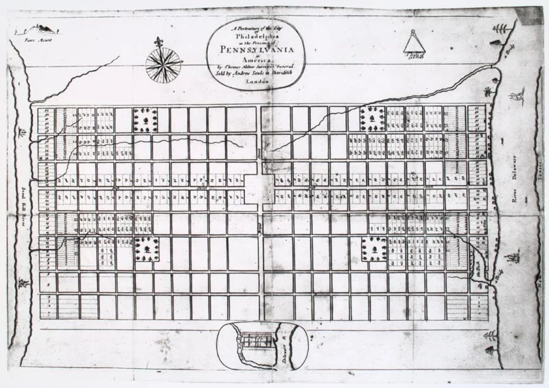
Great cities make sense. They follow rules, patterns and grids that feel familiar. Even if you’ve never been there before, a well-designed city gives you confidence that you can navigate without getting lost. A legible city has a logic to its layout, plenty of signage and well-defined landmarks and borders.
You can apply the same idea of legibility to workplace design. Nobody likes getting lost in a labyrinth or winding up in the warehouse when all you wanted was a washroom.
Clarity of place leads to clarity of purpose.
- What steps can you take to make your space more intuitive?
- Does your office have a sense of natural flow from one department to the next?
- Does the sense of order and organization disappear once you leave the reception area?
TAKE ACTION: Add clear signage, distinct design elements, or indoor “landmarks” to establish a clear configuration of space. Color works brilliantly as a quick way to distinguish departments.
2. Create a sense of place.
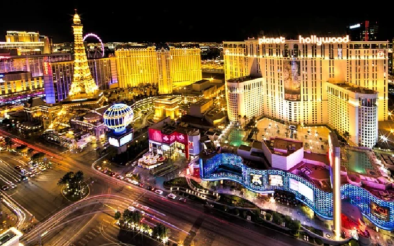
Close your eyes and picture yourself in Times Square, on the beach in Belize, or walking down the Las Vegas strip on a Saturday night. Each location has its own distinct feeling and personality. They look, sound and even smell unique.
I’m not suggesting that you need to install a replica of the Bellagio fountains in your lobby to create a sense of place. But you should do something. Because when people go to Vegas, they know they’re in Vegas.
Nobody ever confused Caesar’s Palace for the Newark Airport Holiday Inn.
- Does your office have a strong sense of place?
- Or could you be standing in any office, anywhere in the world?
- Could a stranger off the street walk into your workplace and guess what kind of work you do?
- Is it clear what your company cares about?
TAKE ACTION: Creating a dynamic workplace means creating a sense of somewhere, instead of settling for anywhere. An easy way to set yourself apart is by appealing to the senses. Add bold visual accents. Add texture to walls or furniture. Create an office soundtrack.
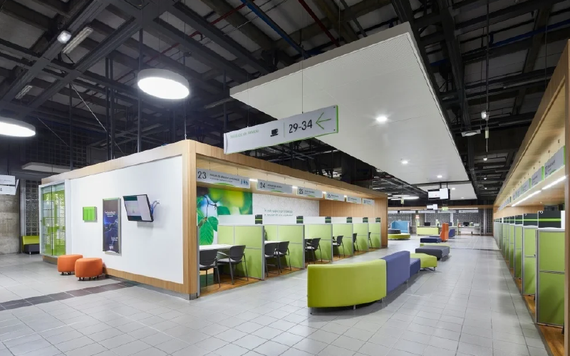
3. Balance consistency and variation.
Part of what makes travel exciting is the sense of surprise and discovery that comes from visiting new places. Great cities have a rhythm and a texture that can change from street to street.
You can walk for blocks in London and see nothing but classically designed luxury homes before stumbling onto a stretch of ultra-modern shops and skyscrapers. A few minutes later, you can touch a stone wall built in the Middle Ages. But somehow, no matter where you go, it always still feels like London.
Your workplace design should aspire to that same feeling. It should feel consistent, but occasionally surprising. Change up the look of spaces and change up the type of spaces within your office.

Variety is becoming one of the most requested workplace features for young professionals. New generations of workers aren’t interested in cookie-cutter offices that offer little flexibility. They want choice and lots of it.
TAKE ACTION: Anchor your office with a design theme, but add details that keep spaces interesting and engaging. Break up the monotony of crowded spaces and rethink underused areas. Give themes to your meeting rooms. Add a community work table or benching options for remote employees and freelancers.
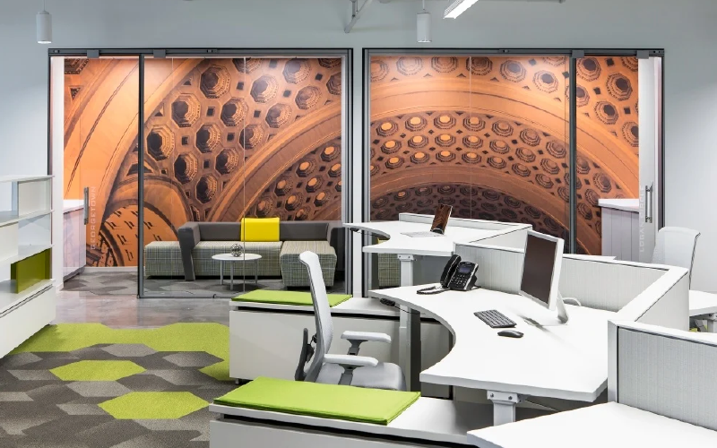
4. Make a statement.
One of my favorite things to discover in a new city is the public art. I’m always drawn to iconic, larger-than-life pieces. Think of the last time you stood beneath a huge mural, a towering sculpture, or an iconic landmark. If you’re like me, you take lots of pictures and make a lasting memory.
You can create areas of your office that have the same effect.
- After someone visits your workplace, what will they remember?
- It sounds silly, but is any part of your workplace “selfie-worthy”?
TAKE ACTION: Add a particularly bold piece of art, a unique piece of furniture, one brightly colored wall, an oversized logo, an animatronic mascot, or a dazzling display of your product line. Whatever you do, make sure the statement resonates with who you are as a company and helps reinforce your message and mission.
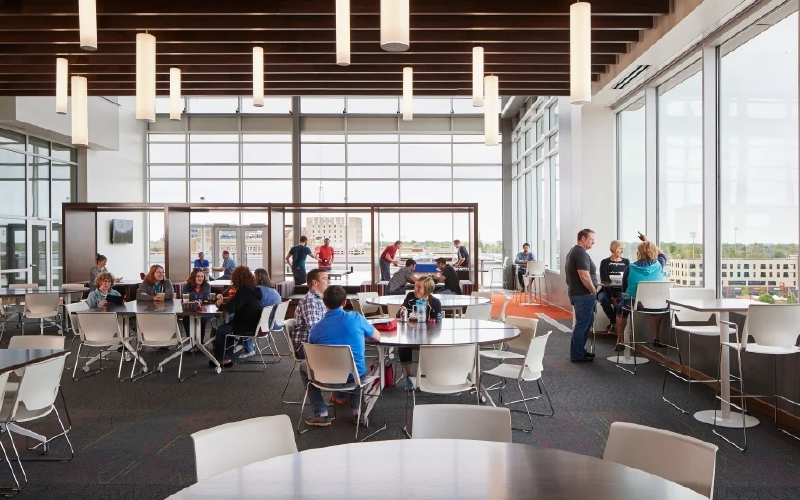
5. Promote social interaction.
A city comes to life when its citizens come together. That’s why great urban plans always include common areas like parks and plazas. Public meeting spaces have been part of villages and towns since the dawn of civilization because they help create a sense of solidarity and security.
In modern offices, adding collaboration and casual space is essential for building company culture. The right designs can help strengthen relationships, boost morale and stimulate innovation. Smart workplace plans give priority to these areas and recognize that big ideas love to show up in low-stress, comfortable social spaces.
TAKE ACTION: Break up silos. Add relaxed seating to a lounge area or commandeer an empty office. Reconfigure furniture to encourage more traffic and interactions between departments. Add table games, and message boards or start an ongoing, company-wide creative project.

6. Maximize functionality and flow.
Cities are like complex machines and the only way they run is if all the pieces work together. Even the most glamorous cities in the world are driven by practical infrastructure plans that coordinate things like plumbing and electricity and traffic flow.
Trust me on this, Paris is much less fabulous when the toilets don’t flush and trash piles up on the sidewalk.
Likewise, it’s important to remember that your office has a job to do. Your workplace design can bend to certain requests and demands from employees, but ultimately, your layout needs to improve efficiency and productivity.
TAKE ACTION: Observe how people really move through your office space. Consider an adjacency study. Make an organized effort to reduce redundancies and footsteps.
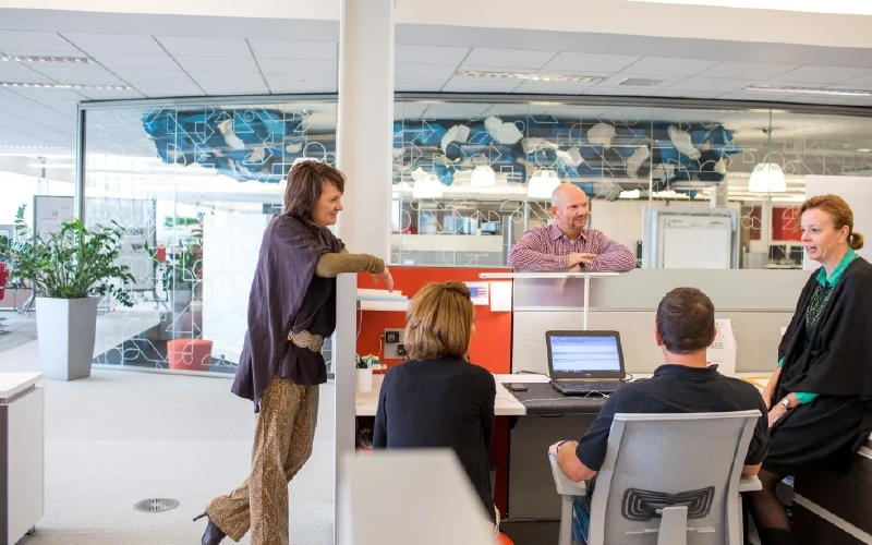
7. Design for the people.
The life force of every city is its citizens. They determine how, when and if a city evolves. They create the identity. They create the culture. They call the shots.
That’s why one of the cardinal rules of urban planning is to design for the population you have. Give them what they need and want. Planners don’t just take a red pen to neighborhood plans, print out a new set of blueprints and then cross their fingers and hope that the people declare them a genius. They rely on data, facts and feedback.
The same goes for your office design. Every great workplace starts with input from the people who will work in that place. Even the most brilliant design plan is doomed without stakeholder insight.
TAKE ACTION: Create surveys. Hold planning meetings. Ask questions about what employees need to do their jobs and listen to the answers. Continue the feedback loop and continue to make adjustments and improvements as necessary.

