What Van Gogh Can Teach Us About Workplace Design
By Matt Brady

9 Practical Design Principles That Will Help You Create Your Next Office Masterpiece
Office design has changed.
Office spaces are becoming less about fitting cubicles into space and more about how those spaces feel to employees and fit into the bigger brand picture.
What was once a very practical and mathematical practice of arranging people and furniture into square footage has now become a much more subjective exercise.
Since the modern workplace has become more a reflection of creative corporate expression and employee desires, the design of these spaces can sometimes pose a challenge to the “non-artistic.”
Some facilities managers may even feel like, instead of being asked to build an efficient office machine, they’ve been commissioned to paint a masterpiece.
If you find yourself intimidated by the sudden shift from hard numbers to fine art, fear not. Smart workplace design is possible even if you don’t have a clue what the Golden Ratio is or know the first thing about Feng Shui.
Renowned artists like Vincent Van Gogh used basic design concepts to create masterpieces. Those same aesthetic guidelines can be applied to the design of your professional workspace.
Here’s a list of practical principles that can help you design a workspace worthy of high praise.
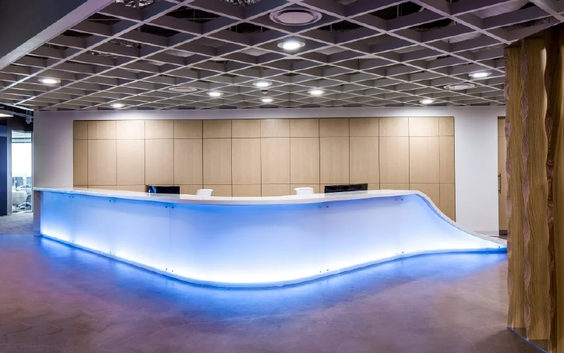
EMPHASIS
Show People Where to Look
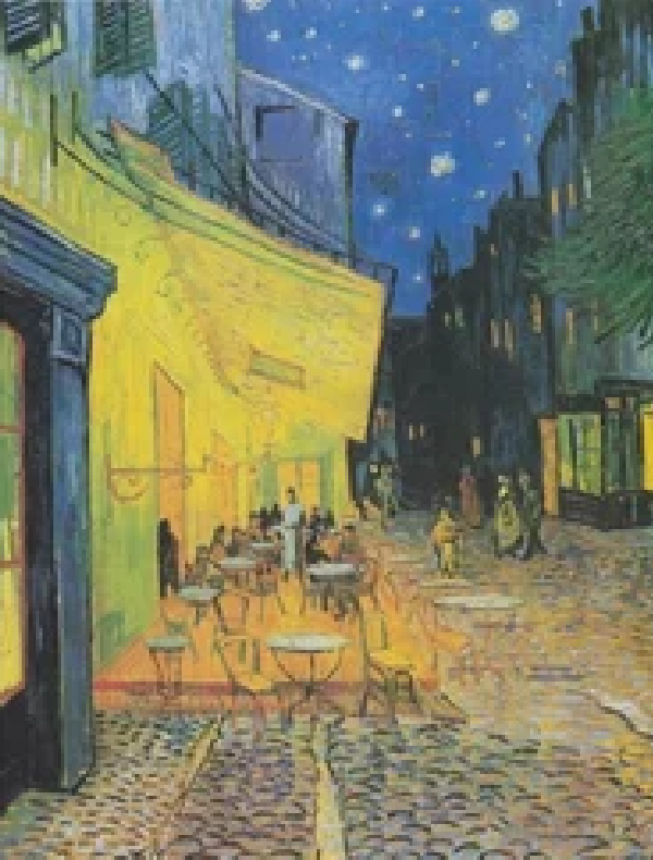
Van Gogh used emphasis by creating contrasting color or brush techniques to make one thing stand out in a painting. His use of bright yellow in Café Terrace At Night immediately focuses attention on the café portion of the painting. The same idea can be applied to workplace design.
Focus on what you want people to see first. Every room within a workplace has a central element, while other parts of the room can be downplayed. Consider using a large lighting fixture that is hung lower within the room to attract the eye or set apart a lobby with a boldly colored reception desk that will naturally draw visitors when they walk through the door.
BALANCE
Create a Sense of Equilibrium
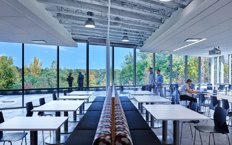
It’s important to create an office space that’s comfortable in terms of balance. Spaces that are out of balance will feel uncomfortable and will not be utilized. There are three main categories of balance that are important to know: symmetrical, asymmetrical, and radial.
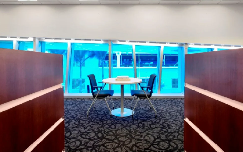
Symmetrical balance focuses on having the same kind of furniture and spacing on either side of the room. This can be achieved by having a central walkway down a room with the same pieces of furniture on either side of the aisle.
However, it’s not just furniture that symmetry can relate to. Other items within the office like light fixtures, paint colors, and even woodwork can create a sense of symmetrical balance. Many employees enjoy the feeling of stability that a symmetrical workspace can bring but others will find it boring and repetitive.
Asymmetrical balance mixes up the office to create different spaces within the room but in a balanced way. This would look like an office space that has different pieces of furniture within it but the mixture of placement and furniture make the room still feel equal on either side.
Asymmetrical balance focuses primarily on the visual aspects of a workspace: the way that the space looks makes it feel balanced. Not only does the size of furniture matter to the visual aspects of a room but also the width and weight of an object.
For example, placing solid wood desks with full paneling on one side of the room while placing minimal metal desks with an open framework would make the room feel asymmetrically unbalanced. The desks may be the same size on top for each employee but visually, the room will feel out of sorts.
Radial balance is another form of symmetry that revolves in a circular shape around a central point. This would be seen in a conference room with chairs surrounding a circular table or even a circular rotunda or lobby desk featured in the middle of a room.
SCALE & PROPORTION
Set the Rules of Relationships in Space

Van Gogh used the artistic elements of scale and proportion in order to create emphasis in a painting. For example, The Starry Night showcases the majesty of the stars by making them much larger than they would normally appear to the eye.
Scale and proportion are also important in workplace design in order to make a room feel welcoming to employees while also being functional. Always leave “white space” between furniture to allow people’s eyes to rest.
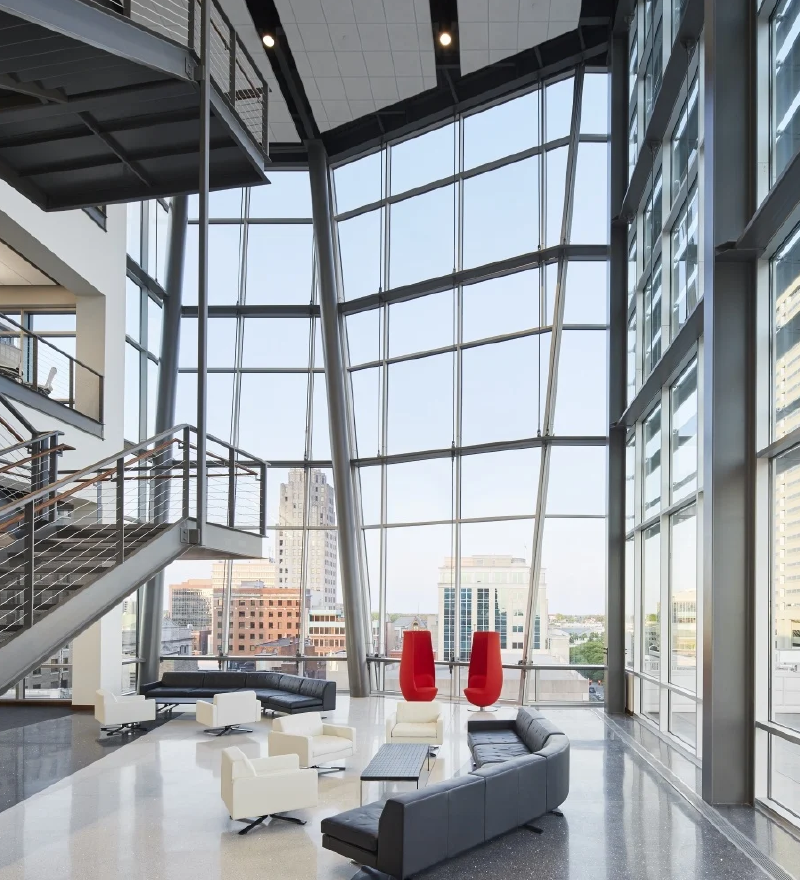
Scale is defined as the relationship between two objects. In the workplace, scale can be seen everywhere from the size of the desk chairs to the height of the countertops. Most functional aspects of the office are built to a human scale, but showcase areas are often laid out on a much grander scale for maximum impact.
Always consider the size of the room and the height of the ceiling when choosing furniture. High, open spaces can accommodate larger, heavier pieces. Smaller rooms require more appropriate-sized furniture.
Proportion is slightly different from scale in that it refers to the 3-D relationship between the objects inside a space. For facilities managers looking to incorporate proportion into a workplace, it is best to hire an interior designer to help you with this more complicated design aspect.

COLOR
Set the Tone and Establish Mood
Artists use color in their paintings to emotionally connect with people. Incorporating color into workplace design is just as important. Use it to create a visually pleasant space and evoke strong emotions where needed.
Most workplace palettes start with company brand colors. Use a color wheel to make sure any other colors you add complement those core colors.
For example: Choosing lobby chairs in a yellow fabric would naturally complement a mostly blue logo design while choosing the same chairs in a bright purple fabric would clash.
Understanding the psychological ways that colors affect the brain is also a key part of workplace design.
- Blue and grey are said to provoke thought and concentration.
- Reds elicit a very intense and physical reaction.
- Yellow hues can make people feel happy or anxious.
- Warm colors, like red and yellow, are said to be stimulating to the brain.
- Cool colors, like blue or grey, help people feel relaxed.
LINE & MOVEMENT
Create Drama and Guide the Eye
Lines are the most basic element in design. They can be used to guide the viewer’s eye or evoke emotion. Different lines—horizontally, vertically, diagonally, or curved—create different feelings and senses of movement.
Horizontal lines are said to be the most natural form of line because peripheral vision allows our eyes to see the entire line.
Lines that run left to right or vice versa suggest stability. Use horizontal lines in a space to help create focus. For example, a horizontal line painted toward the top of a wall can draw the eye along the line and create a sense of protection.
Vertical lines move above the visual pane which suggests elevation and strength. Many office spaces use vertical lines to make rooms feel taller than they really are. Consider using vertical lines on one wall of a small lobby in order to make the room feel larger while also providing a subconscious feeling of strength.
Diagonal lines add energy and excitement to a space by directing the eye to a certain point of the room. If you want to add volume to a smaller space, consider using a well-placed diagonal line to make the room feel larger. But use caution, because diagonal lines can cause confusion if used incorrectly.
Curved lines evoke playful and soothing emotions. Curved lines can be either a full circle or just a portion of an arched or circular shape. You’ll notice that many offices that cater to children have curved lines either within the office furniture or on the walls. Consider adding wall decals of brightly colored circles or even circular stools in order to create a more fun and playful space.
PATTERN
Add Visual Interest and Define Space
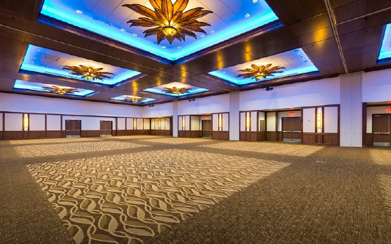
Another important artistic element of workplace design is pattern. Patterns are a repetition of more than one design element working together.
You can add patterns simply by installing patterned carpet, wall covering, or window treatments. Natural materials like wood, stone or metal provide an opportunity to add basic patterns.
However, just like using too much color in a space can overpower an office, the overuse of patterns within a space can also quickly cause feelings of anxiety and confusion. Patterns should be used in a balanced manner within a space with careful thought to not overwhelm it.
REPETITION & RHYTHM
Create a Sense of Consistency and Flow

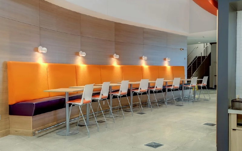
Many artists use repetition and rhythm to create consistency, movement and flow within a composition. Van Gogh’s Irises are a good example of repetition because of the placement of flowers within the painting. Rhythm is also used in this piece to show how certain flowers move with each other and others fall away.
Much like musicians use rhythm in music by alternating notes and silence, visual artists create rhythm by alternating negative and positive space.
Repetition can be used within a room by using the same kind of chairs and desks within a space. Placing these repetitive items throughout the office creates a feeling of stability and comfort for employees. For example, the seating options in the lobby could be used in other parts of the office including conference rooms and conversational areas.
Rhythm is used within the office to help create feelings of excitement. The movement, or perceived movement of a static design element, helps to create the feeling of activity. An example of this would be a curved staircase that creates movement within the visual plane of a space.
TEXTURE & VARIETY
Add Visual and Tactile Layers
Texture has become an important part of workplace design.
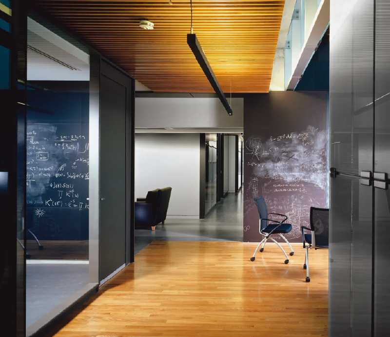
Part of the modern workplace movement has been a revolt against the cookie-cutter office design of the past. Where we once expected a space full of manufactured, modular furniture, overrun by the minimal palette of cold, corporate colors, the professional look has become much richer and more like home.
You can up your texture game easily by choosing seating options with interesting fabric, incorporating rugs, adding unique pieces of furniture or installing lighting fixtures with different materials and shapes. Using rough wood or stones for walls or counters can create a more tactile experience.
Variety within a workplace design comes from using different colors, styles, shapes and surfaces. Choosing a wide variety of elements engages the attention of employees and visitors to your workplace.
Variety not only helps define different areas within your office, but it also generates overall excitement and adds layers of depth and interest to a space.
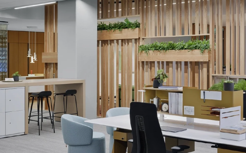
HARMONY & UNITY
Create a Sense of Equilibrium
Van Gogh’s masterpieces make sense. They are unmistakably his work and when we look at them in a museum or gallery, they feel finished.
Harmony and Unity in workplace design are achieved when your space feels connected, consistent and complete. Do your different departments look like parts of the same whole? Do the reception area and the mailroom “feel” the same? Is there a consistent visual “storyline” throughout?
Just like Van Gogh used the same colors, shapes, and textures within a painting, Facility Managers can use these elements to create a cohesive office space. A huge part of creating the perfect workplace is the planning. Nothing is more critical than those early phases, working with your team to decide on the visual vocabulary (the style, materials, color, etc.) and layout.
Everything should work together “on paper” before it exists in reality. If you do the right work (with the right partners), you’ll see the results in the final design. Individual design aspects that have been chosen are working together as pieces of a whole environment.

